Design from zero for travel fintech
Client
RewardExpert
Industries
Travel / Fintech
Loyalty & Rewards
Services
Design Leadership
Product Design
Design System
Timeline
3 years

RewardExpert helps travellers get more out of airline miles, loyalty points and credit cards. US company with R&D in Kyiv.
I joined as Lead Designer. There was no design function: no process, no visual language, no system, and a product surface already growing across several teams. The company needed a way to design and ship several products at once.
Users couldn't tell what a reward ticket actually cost them. Miles, cash prices, fees and programme valuations lived in different places, so people either overpaid or gave up and booked with cash. Interviews and support tickets kept landing on the same sentence: not "I can't find flights", but "I can't tell if this is a good deal".
Underneath that, every feature was being designed from scratch. Nothing was reusable, and the company was planning more products than that approach could carry.

Price Confidence
“I can’t tell if this is a good deal — so I just pay cash and keep the miles.”
Maya Ferreira
4 loyalty programs
Hidden Cost
“The fees only showed up on the last screen. My free flight cost me €184.”
Priya Raman
2 loyalty programs
Valuation
“I had 72k miles. I still booked with cash, because I couldn’t do the math in my head.”
Tomash Rivera
3 loyalty programs
I ran the first round of research myself. Interviews, support ticket analysis, time sitting with the support team watching where people gave up.
Then I set up a rhythm the team could run without me: standups and planning to keep delivery moving, critique to hold one quality bar across three products, and regular sharing so research and decisions didn't stay inside one designer's head. So, product decisions came from evidence the whole team had seen.
Nobody was asking where to find a flight. They were asking whether it was worth it.

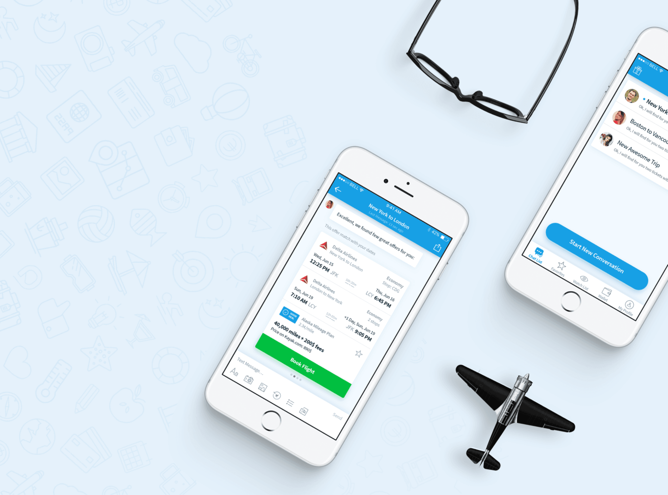
The first flight search built around miles rather than cash. Valuation goes directly into the result: miles, fees and a value rating side by side, so a reward booking can be compared to a cash fare without doing maths.


A comparison tool organised by what someone is trying to get (no annual fee, lounge access, miles, cash back) rather than by which bank issues it.
I led design across all three products, and the landing page was where they had to come together as one company: Travel, Credit Cards and Concierge on a single page, in one visual language, from the same components.
The SEO content pages were built the same way, and they held attention. Page depth was consistently strong: people came in for one answer and kept reading.
What I took from it
RewardExpert taught me where the leverage is. It's in the team, the system and the process underneath them. Owning both design and frontend meant the system got built once and used everywhere. That's what let a team of six ship three products in a domain this complicated.
Since December 2019 RewardExpert has been developing independently. Most of the features shown here are no longer available.