Making invisible work visible
Client
Maksym Cherniatevych
Industries
IT consulting
B2B SaaS
Services
UX & UI design for digital products
AI-driven product experiences
Timeline
6 weeks
Maksym builds backend systems that stay fast under load. He came asking for a new design and
a blog. What he needed was a different way to sell. I reworked his offer, built a content strategy around how his clients buy, and designed a site with its own illustration generator, so technical writing never goes out without visuals.
Backend work has nothing to show. When it's done right, nothing happens. Maksym's site listed his services with a price next to each one, and his plan was a blog full of notes from the field. A business owner saw an engineer selling hours task by task, with no picture of what working with him would change.


A new design on top of a price list would still look like a price list. So we took the per-service prices off the site. Instead of single tasks, Maksym now sells two things: a fractional engineer, or an engineering retainer. Case studies became the proof, and I convinced him to turn them into stories people actually want to read, not a list of technical jobs. The notes stayed, but in their own section, as depth for CTOs rather than as the main pitch.
A long technical story loses readers halfway through, so the case study page has quiet motion that pulls them forward. Footnotes sit next to the text and come alive when the reader reaches the line they explain. They're there when needed and stay out of the way otherwise. Each new section eases in as you scroll, so the page reveals the story step by step instead of dumping it all at once.

Each part of the site got one job. The home page lists eight things Maksym builds, and each comes with the result the client gets. A four-step process shows what working together looks like. The contact block promises a transparent estimate after a 30-minute call. Case studies sell to business owners, and notes give technical readers something to check.
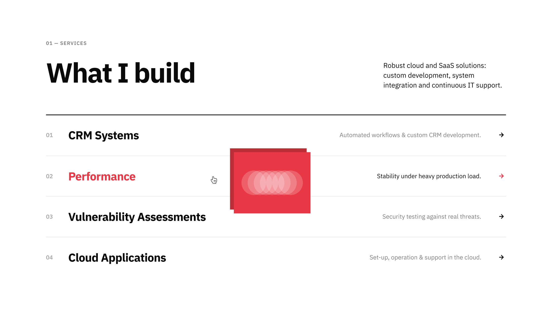


Technical content rarely comes with visuals, and stock images would break the style. I drew a set of 20 line-art icons that defined the visual language, then built a generator in Claude Code that extends it. It combines two simple shapes (circle, square, triangle) into one overlapping composition, following strict rules for size, overlap and placement. The generator measures the real shared area and throws out anything that isn't a clear overlap. Every new article or case study gets its own cover in the house style, and no designer is needed.